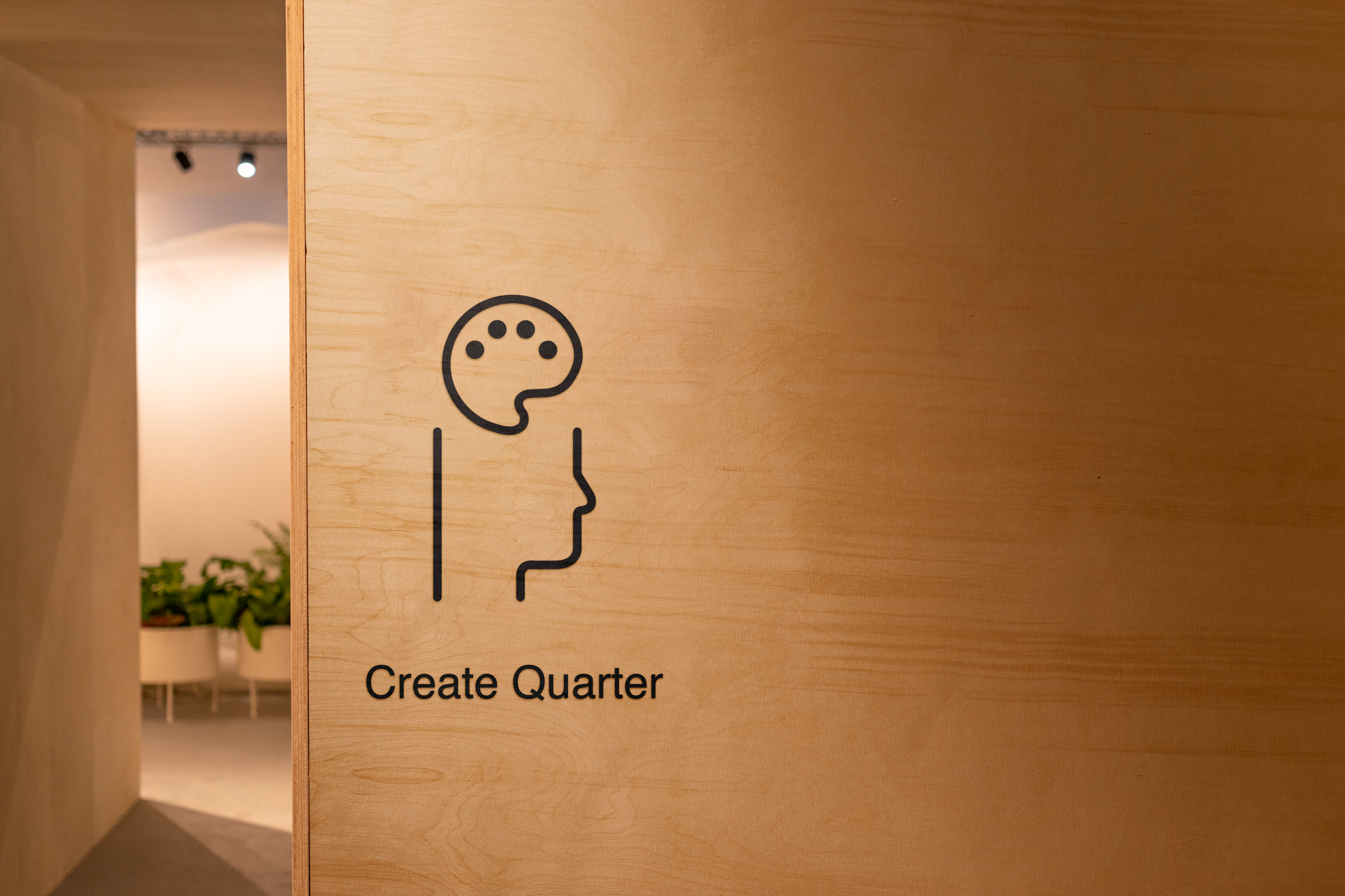
On a visit to the State Library of Victoria we were asked to navigate the library and monitor our experience, from there we were asked to create a set of pictograms to aide wayfinding, we then needed to find a way to make some of these pictograms active. I decided to use a consistently thin line weight and a simple sans serif typeface to create clear and sharp pictograms. By leaving the head shape as an open object, my design lends itself well to being extended as seen in the "Ian Potter Queen's Hall" pictogram which was one of my active pictograms made simply by extending the line into an arrow to show the direction visitors to the library should follow.
