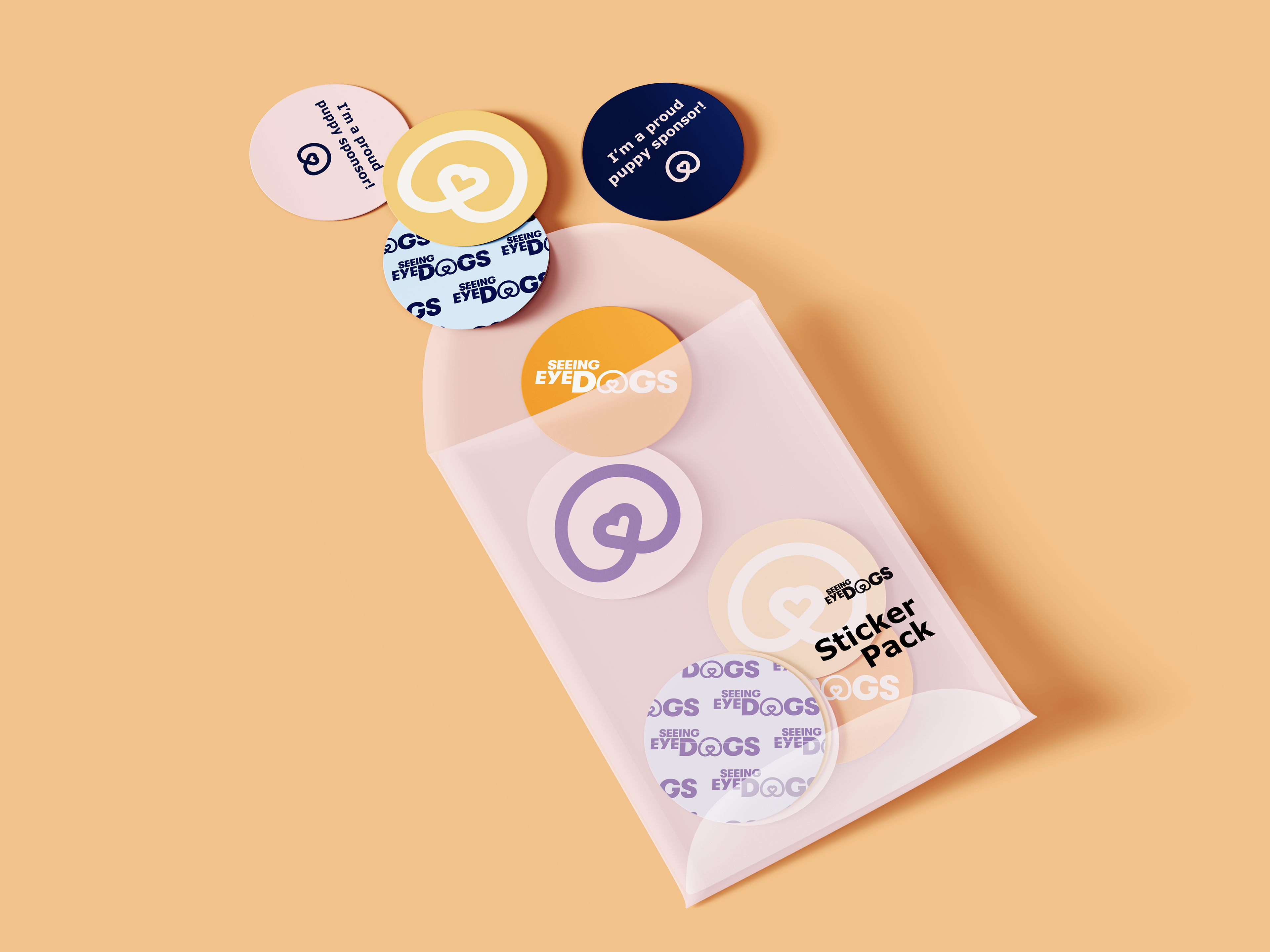
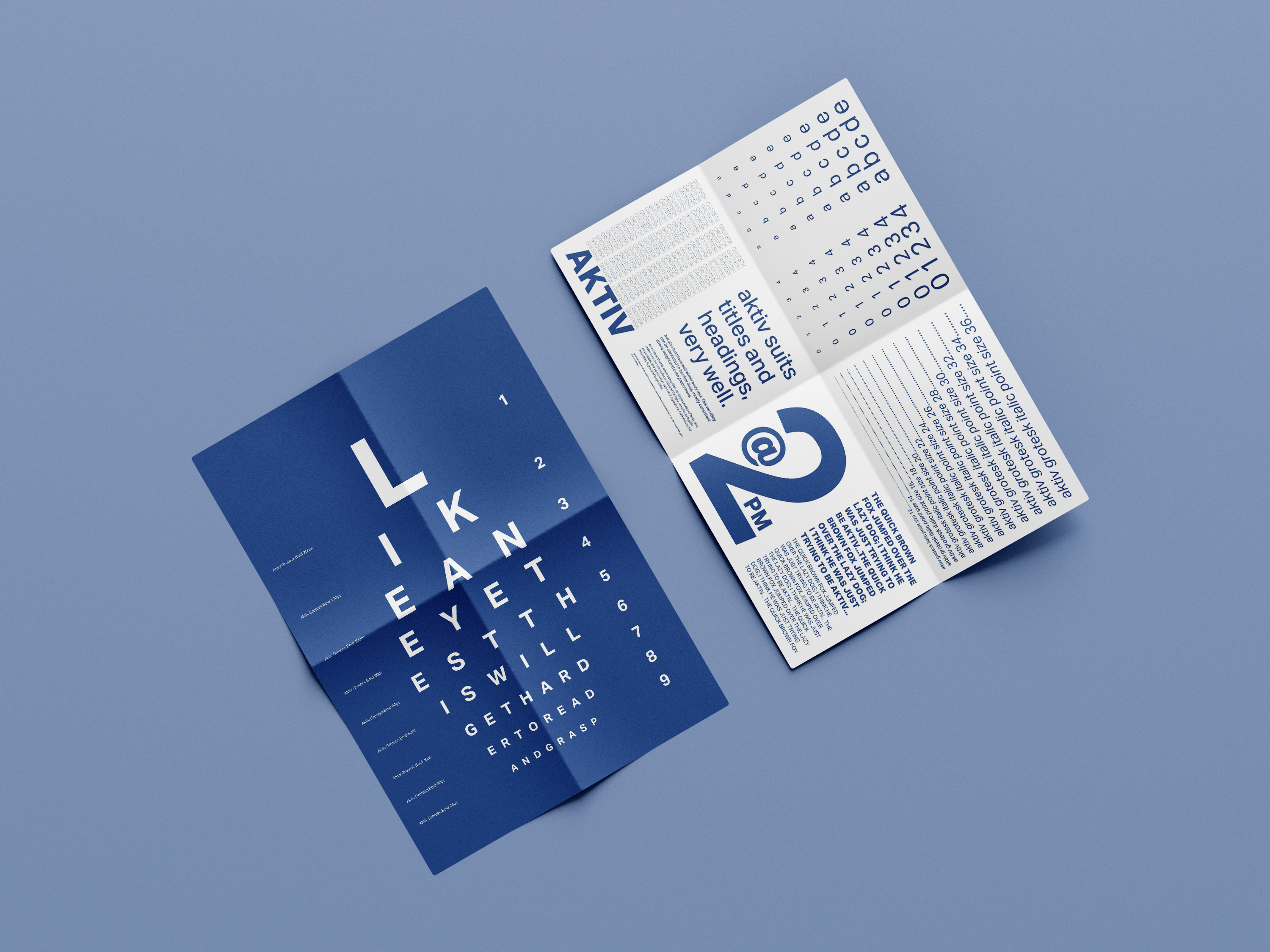
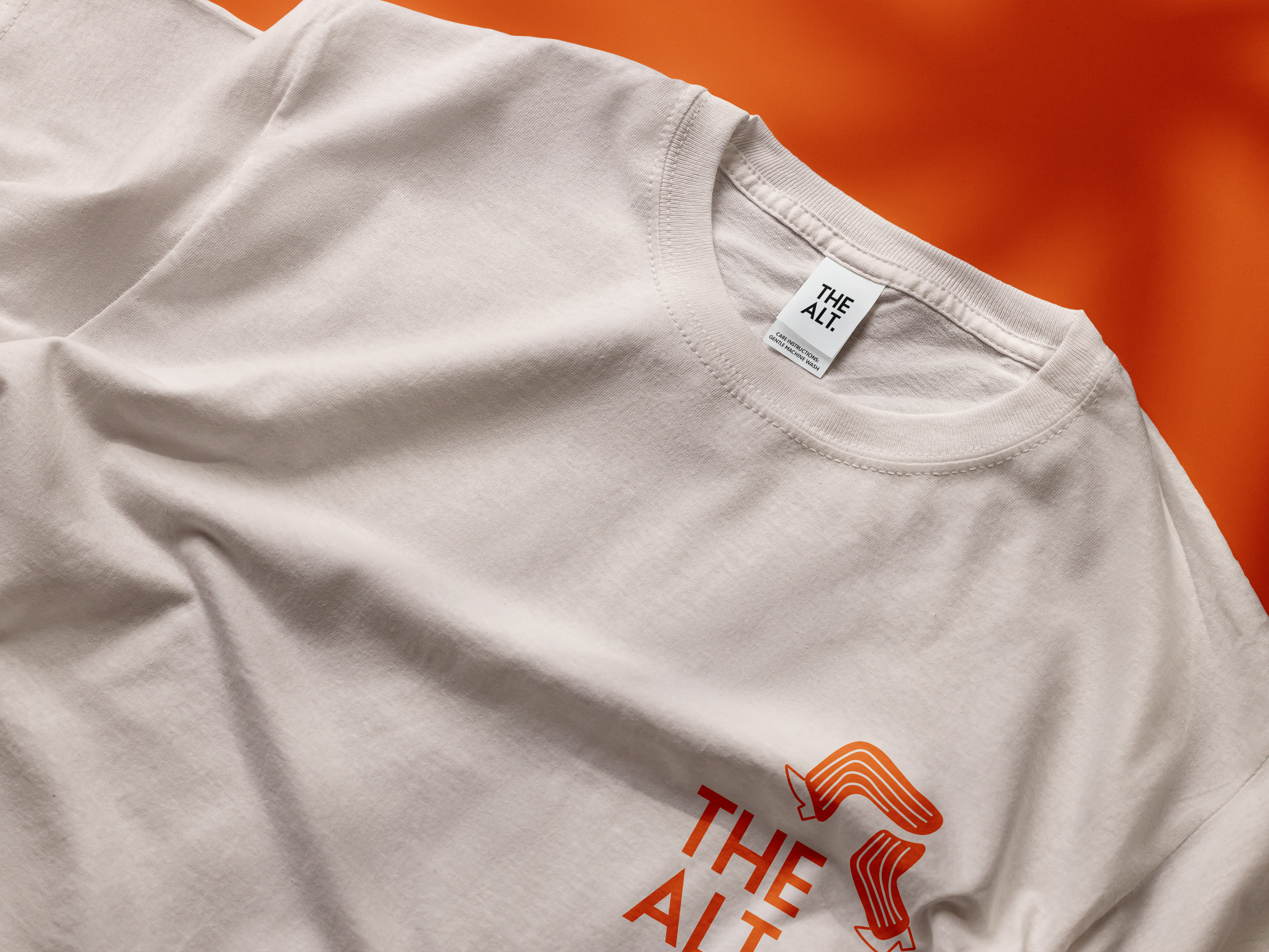
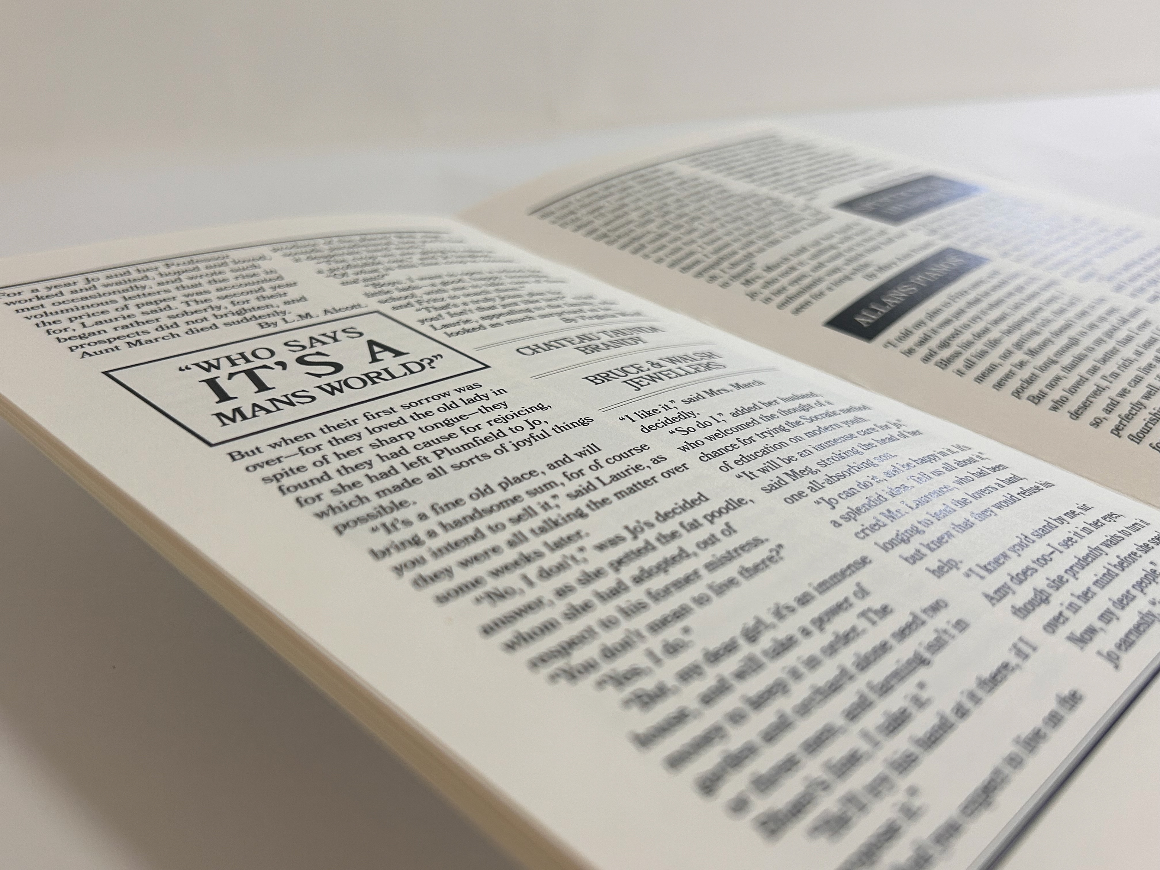
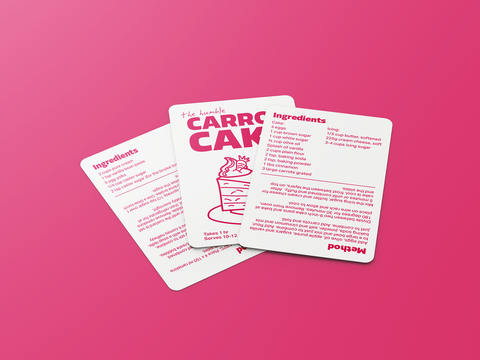
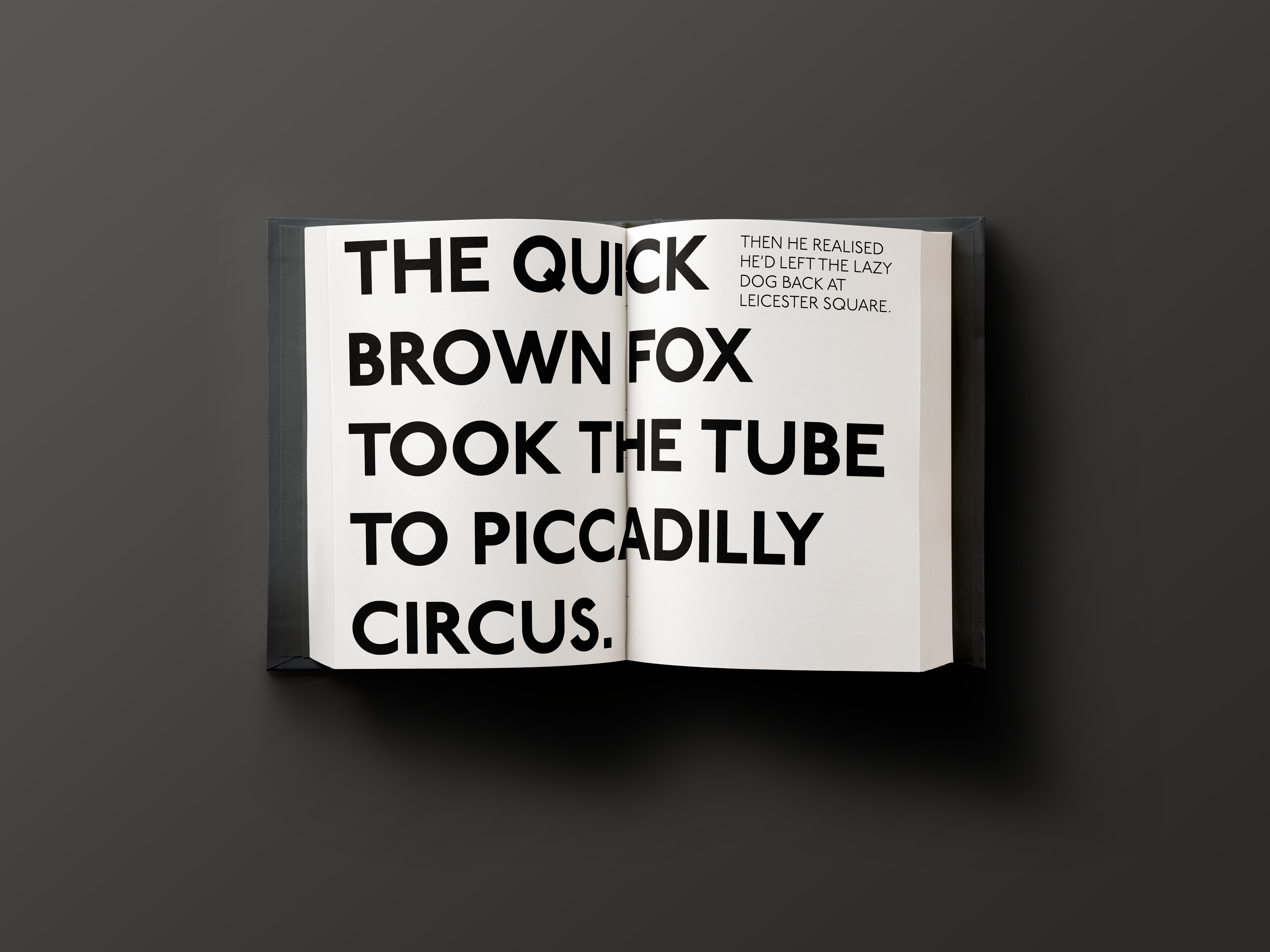
This project was based on choosing a popular charity and giving them a new identity or just refreshing their branding, I chose Seeing Eye Dogs knowing that the work they do is crucial however their branding needs to be updated. The process of coming up with a logo for this brand was difficult and took a lot of testing and starting over, ultimately I landed on an icon that could also become the "o" in the word dogs. It combines a heart shape, dog nose and a circular shape combining the brand values and functions of Seeing Eye Dogs Australia. The branding update also included new colours, typefaces and stationary for the brand.


